The July 2021 Requestbox update includes improved support for mobile devices and small screens. Keep reading for more details of the improvements we have made.
New Responsive Menu and Filters
We have improved mobile device layouts with responsive menus, filters and grid value wrapping:
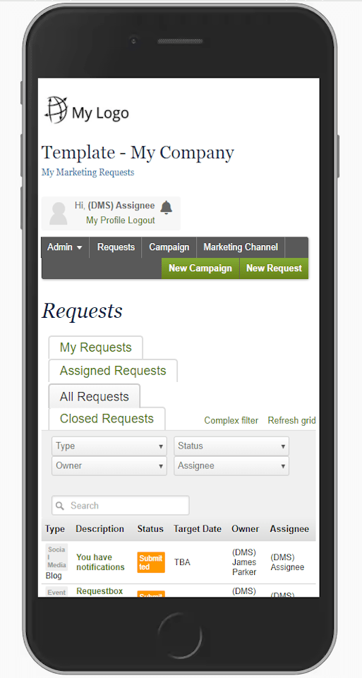
Old Layout
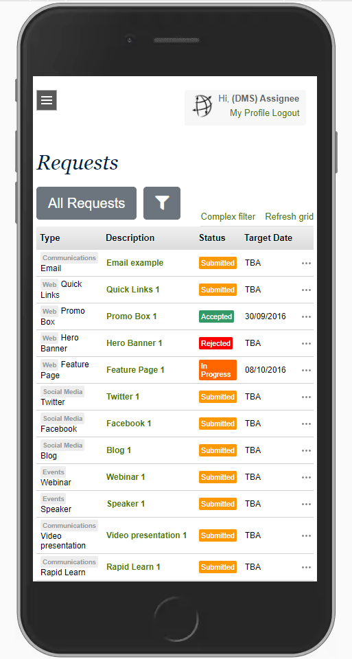
New Layout
Features include:
- Main menu changes to Hamburger Menu icon on small screens
- Hamburger Menu icon triggers new left sliding menu
- Hamburger Menu icon triggers new left sliding menu
- Grid tabs change to a single button on small screens
- Clicking the button shows the available tabs in a left sliding menu
- Clicking the button shows the available tabs in a left sliding menu
- Filters are hidden on small screens and a filter icon button is displayed
- Clicking the filter button will show/hide the filters
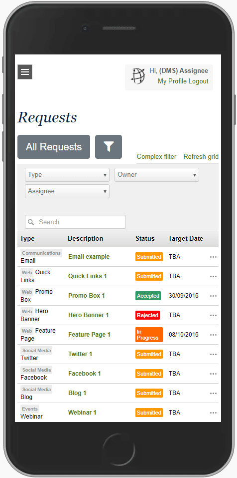
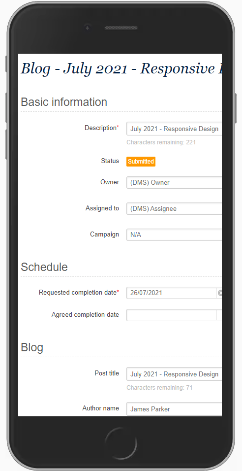
Responsive Forms
Improved Form control layout on mobile devices:
Old Layout

New Layout
We will continue to improve the Requestbox experience across multiple devices. Please let us know if you have any feedback/suggestions.
 Requestbox